Tools
Building a Terminal UI Broke My Brain
2025-12-15
0 views
admin
Coming From the Browser World ## The Hardest Screen: AI Analysis ## What I Learned (So Far) ## 1. Stop thinking in pixels ## 2. Measure everything explicitly ## 3. Borders lie ## 4. Debugging TUIs requires instrumentation ## What I’m Doing Next I’ve spent most of my career building things for the browser. If something looks wrong, you open DevTools.
If spacing is off, you inspect the DOM.
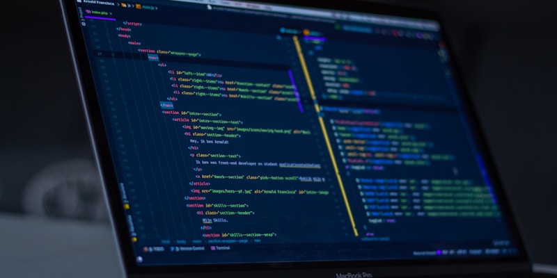
If the layout is cursed, you tweak CSS until it stops yelling at you. So naturally, I thought building a Terminal UI (TUI) would be… similar. This post is part of me building in public while working on a project called TurboStream — a developer tool that lets you connect high-velocity WebSocket streams (blockchains, BGP, finance feeds, etc.) to LLMs without draining tokens or crashing your system. The backend was the easy part.
The Terminal UI nearly ended me. There’s no DOM inspector.
There’s no “hover to see bounding box.”
You change one lipgloss.Style() and suddenly everything shifts. The screen that caused the most pain was the AI Analysis panel. Conceptually, it’s simple: I kept ending up with: It looked fine at one size, then completely broke when resized. If you’ve used Bubble Tea, you know the feeling:
“This should work… why doesn’t it?” A few lessons that finally started to click: Terminal layout is about constraints, not visuals.
Everything is rows × columns. Nothing is free. If you don’t calculate width/height yourself, Bubble Tea will happily surprise you. Borders and padding count.
That “one extra column” is always your fault. It felt ugly — but it worked. To make this sane long-term, my next steps are: Templates let you quickly answer FAQs or store snippets for re-use. Are you sure you want to hide this comment? It will become hidden in your post, but will still be visible via the comment's permalink. Hide child comments as well For further actions, you may consider blocking this person and/or reporting abuse CODE_BLOCK:
WebSocket → Cache → Triggers → LLM → Short human-readable alerts. Enter fullscreen mode Exit fullscreen mode CODE_BLOCK:
WebSocket → Cache → Triggers → LLM → Short human-readable alerts. CODE_BLOCK:
WebSocket → Cache → Triggers → LLM → Short human-readable alerts. - Figma → HTML/CSS is mostly mechanical
- Layout is visual
- Debugging is interactive - Layout is math
- Padding is vibes
- “Why is this box 2 columns wider?” is a philosophical question - show LLM context size
- show token usage
- show generation timing
- stream output text - content height changes constantly
- widths need to stay aligned with sibling panels
- scrolling text + borders + padding fight each other - truncated text
- panels overflowing by 1 character
- borders misaligned depending on terminal width - temporary background colors
- width/height labels inside boxes
- fake content to stress layouts - Create a layout debug mode: Toggleable overlays that show component boundaries and sizes.
- Write small layout test harnesses: Instead of debugging inside the full app, isolate one view at a time.
- Standardize layout contracts: Every panel declares what it needs instead of “figuring it out.”
- Accept that TUI UX ≠ Web UX: Different medium, different rules
how-totutorialguidedev.toaimlllm